Selling SaaS is hard (like a Sisyphean task)
Let’s face it, selling technical concepts isn’t easy. You have a great software product that can help your future B2B customers save tons of time, money, and… yes, stress. It looks great, it’s reasonably priced, but you look at your Google Analytics dashboard and financial reports, and what you see is that your free trial conversion rate and sales metrics are far from what you imagined.
The benchmarks for SaaS conversion rates usually oscillate within the 2-5% range, depending on the quality of the incoming traffic. How do you reach that conversion level?
While there’s no one-size-fits-all solution to boost your sales if you run a SaaS business, there are some elements in the SaaS customer journey and on the key pages (mainly your homepage and pricing pages) that you can optimize, in order to reflect your understanding of your target audience, increase your SaaS conversion rate and turn site visitors into users or subscribers.
1. Highlighting specific SaaS features that really matter (customer-centric approach)
When a prospect visits a site offering a B2B software solution, there are usually two scenarios:
- They can’t find or understand the key features that are offered, let alone how they’d make their day-to-day life easier;
- They see too many features and become overwhelmed.
In both cases, the result is the same—the visitor abandons the site feeling either under- or overinformed. How do you make sure that your visitors understand just enough about your product to register for a free trial or request a demo?
You need to pick and promote the top 3-4 reasons (features, benefits) why your existing customers chose you.
If you were asked to name the 5 main reasons why people choose you over your competitors, would you be able to recite them here and now, in the exactly right order? No guessing game allowed. Knowing this is essential to design pages that convert—provide seamless user experience and sell SaaS solutions by clearly addressing the needs of your target audience.
Does your SaaS offer seamless integration capabilities that help users migrate from their old platform in no time AND your clients love it? Then say it on your site.
Is your customer service best-in-class and people adore that about you? Then say it on your site. (We’ll cover the importance of the customer success teams in the process of selling software as a service in a later section.)
What’s the point in promoting your beautiful user interface, design or collaboration features if your site visitors care about completely different factors?

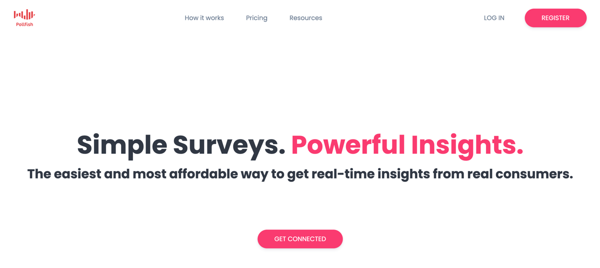
Pollfish, a market research tool, clearly communicates what their customers love about them right from the moment the visitors land on their homepage.
Now, how exactly do you learn all these things that can help you answer the key question—how do I sell my B2B SaaS solution better? You guessed it—through user research (check out our methodology page to see how we approach understanding target audiences and different customer segments).
However, if carrying out detailed research is out of the picture for now (although it truly is THE way to drive SaaS marketing actions), you can invest time and effort in what the best SaaS websites do—making the registration experience risk-free...
2. Explaining the free trial offer (de-risking the onboarding process)
Free trials are great. Not only great—they are essential to give your prospects a chance to experience your app or software before they spend hundreds or thousands of their hard earned dollars.
Designing a sales-friendly free trial is a different challenge (that we might write about in the future), so let’s talk about why your visitors don’t register, even though you offer a no-commitment, cancel-anytime test period…
What we’ve observed over the last years working with tens of different SaaS businesses, is that people usually don’t register for a free trial, because:
- They don’t understand the terms and conditions—you need to clearly state how long the free trial lasts and what are the potential limitations (for example, can users test all the features they’d get with the full version?);
- They don’t want to get charged—even you if you say “cancel anytime”, your leads won’t believe it. You need to clearly specify how the cancellation process works, for example by saying: “We’ll send you two emails—7 and 3 days before your free trial ends—in case you want to cancel.”

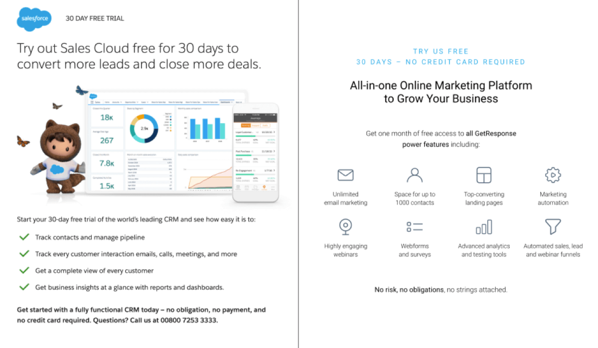
Two examples of free trial pages for two email marketing platforms—SalesForce (left) and GetResponse (right). Both clearly specify the length of the offer and what users would get by registering, but neither mentions emails that would be sent to prevent the unwanted auto-renewal.
Now, there are many models of running free trials. Some of them last 14 days, while others run for 3 months. Sometimes a user needs to enter their credit card information upfront, and in other cases only a day before the end of the testing period.
No matter what your approach is, you need to make sure that your prospects know what they sign up for. Only by providing an informed decision-making process can you increase the conversion rate on your SaaS site (from unregistered visitors to free users).
3. Using reviews to communicate the ease of use of your B2B SaaS product
It almost seems like every technical or software product these days is: easy to use, great for beginners, and for people who are not necessarily tech-savvy…
Such key phrases come up so much on SaaS websites, that they’ve lost their value and persuasiveness over time. Your prospects need something more specific, tangible, like how many hours it’d take them to go from zero to a (semi-)power user.
However, being too specific about the learning curve of your product can also harm your business. If you create a claim that anyone can start using it after just 15 minutes, and your free trial users still struggle after 2 hours, your empty promise will backfire.

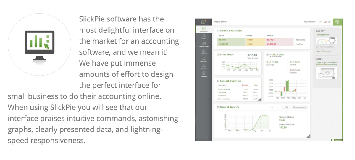
SlickPie, an accounting platform, visualises the “ease of use” by providing screenshots of their dashboard and using positive, empowering words, such as: intuitive, astonishing, lightning-speed. By doing that, they refer to the emotional part of their prospects’ decision-making process.
The safest way to promote the ease of use is to rely on other people’s words. Reviews very often drive SaaS sales (especially if you’re selling to Enterprise users), therefore, when picking testimonials for your key pages, find the ones that talk about how quick to set up your product was, how everybody in the team loved it (almost instantly).
If some of these testimonials mention specific timeframes (“...only after 1 hour!”), then you have a solid piece of content to showcase the simplicity of your offer.
Obviously, you shouldn’t just email your existing customer and almost force them to write a review focused on the ease of use of your product. There are, however, indirect methods to get hold of this type of evidence/ proof—and it’s part of our Sailing Phase.
4. Offering customer support that translates into customer success
We’ve all experienced this—you get excited about a new tool or web app, its product page looks great, the feature list ticks all the boxes, and so you decide to register and start using it. Everything goes well… until it doesn’t anymore.
After the initial butterfly phase, you start to wonder what you can and cannot do. How much can you customize the user dashboard? Can you easily reverse the changes you’re making? Is there a faster, better way to do what you’re trying to do?
This new-user struggle experience leads to three common scenarios:
- #1 Digging through tutorials and technical documentation to find the answers (time-consuming, complicated);
- #2 Reaching the support team (quicker, more “human”);
- #3 Jumping into a rage mode, burning your computer and deciding to move to Bali.
As a serious SaaS business, you simply can’t afford the scenario #3 (unless you decide to open a hotel in Bali…).
Your goal should be to reduce the complexity of the journey for those choosing the scenario #1 (did you know you can A/B-test guides and tutorials?), and to make sure anybody choosing the scenario #2 will feel important and listened to, even if their problem requires more time to handle.
While sailing the seas of conversion rate optimization and user research, we’ve seen, experienced, and even improved numerous customer care models. If you’re looking for a user testing platform (more on them in a separate article) with outstanding and personalized support, our recommendations are:
- UserZoom.com—quick, flexible, friendly staff, available to help from within your account dashboard and follow up via email if needed. They’ll help you set up your studies and resolve any technical issues in minutes. And their product is great, too! [Note: It used to be Validately.com, but UserZoom acquired them in early October 2020.]
- Userlytics.com—probably the best email support we’ve experienced. There are usually 3 or 4 people helping with your problem at the same time, so you are never left alone or waiting. Plus, they’ll go an extra mile to make sure your user tests are high-quality and on time.
How to sell software as a service (what YOU should focus on)
Before you leave this page and start changing everything on your site, we have to warn you. You’ve just learned about the Krakens (aka: conversion rate killers), that we very often see on SaaS websites. Are all of them harming your business? Probably not.
Do you know which ones are the worst and should be slayed first? You need to be very careful when picking your battles, because without enough knowledge and research on your website visitors and target audience, you might be sailing away from your Hidden Treasure (more free and paid conversions).
If you want to have a chat about what’s ruining your SaaS sales and how to fix it, feel free to book a FREE Cartography Session and jump on a call with our Founder to discuss your options. And if not, then enjoy your day and...
Happy (digital) sailing!

